
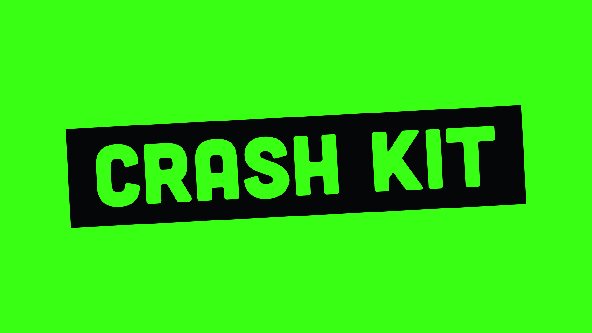
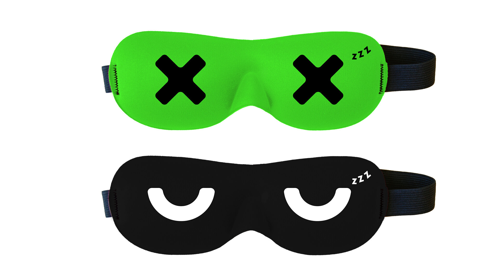
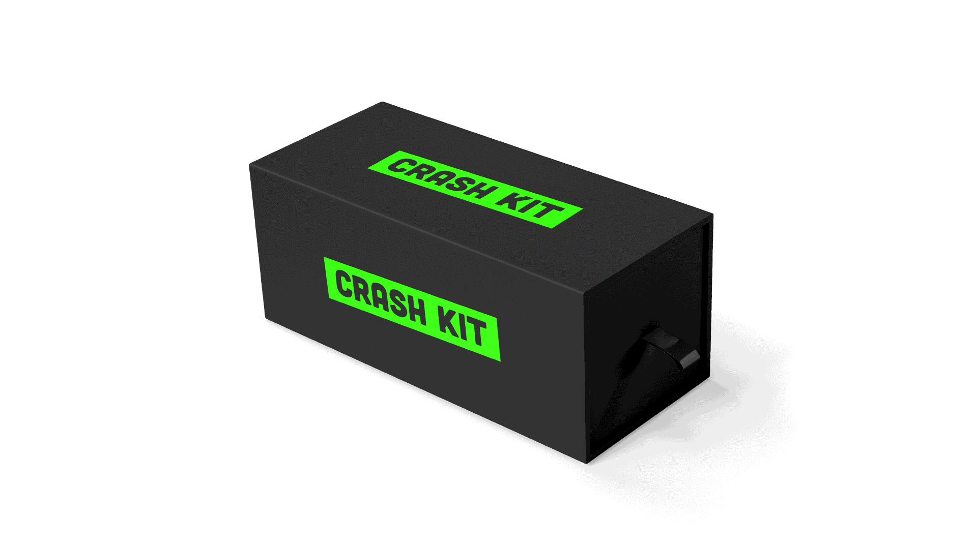
After creating a brand for their adult sleep masks, Drift to Sleep wanted to create a set of sleep products aimed at college students. The kit comes with a high-quality sleep mask and earplugs. They needed to create a name and logo that would fit this new audience and diversify their line of products.
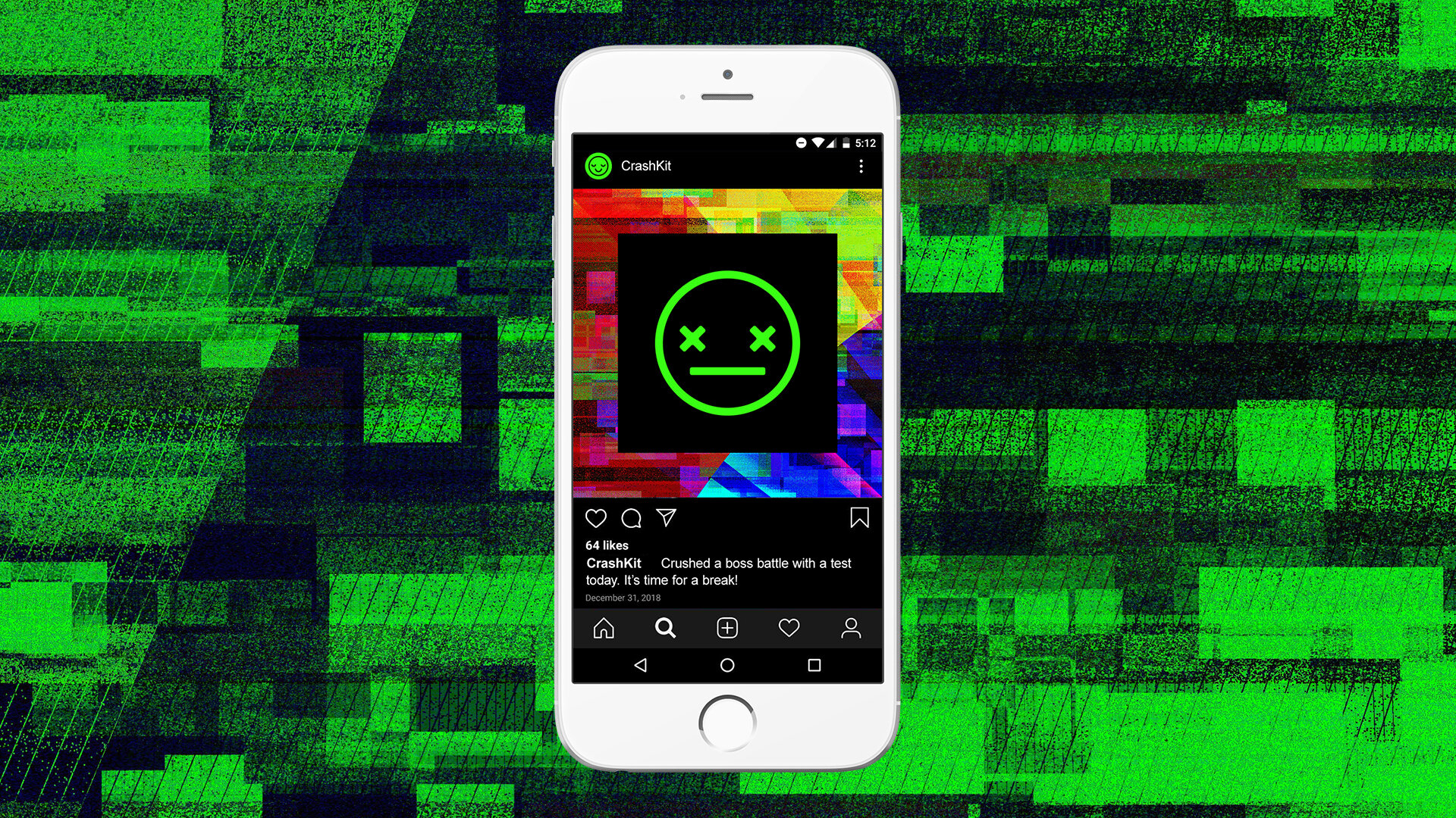
The concept is based on this fact: College is exhausting. With a constant stream of new things between work, school, friends, and relationships, you need rest because your brain is fried and your system is shutting dooown. Crash Kit allows you a moment to power off and reboot without distraction. The logo uses thick highlighted type for a message you can’t miss—it's time for a break! This bold, high-contrast, approach is eye catching for a demographic whose attention is spread thin.
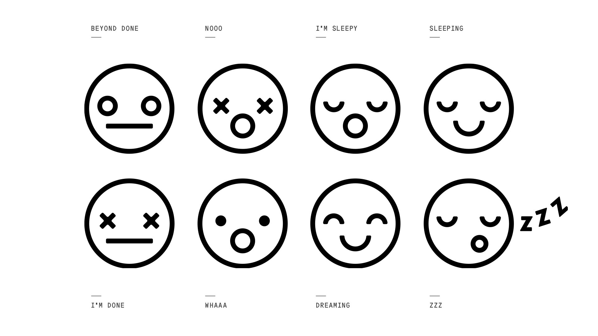
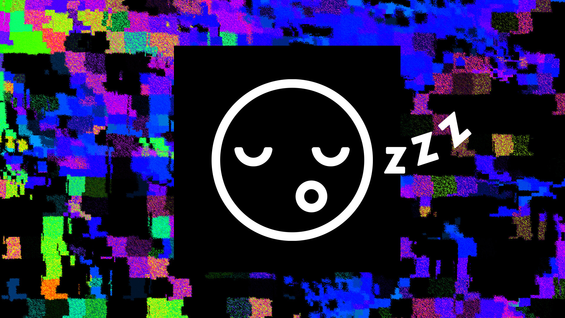
To tell more of the story, I created a set of expressive icons and suggested the use of glitch art and pattern to represent the overload of college life and support a more defined style that is a little dark and little random.
I worked on naming the product, art directed, and created the brand assets with production assistance and creative guidance from the team at verynice.